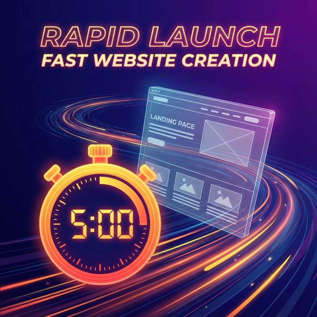
The Five-Minute Challenge
Can you actually build and deploy a real landing page in five minutes? Not a mockup, not a prototype—a working page with real content on a live URL?
Most "quick" approaches don't actually deliver. Template builders take hours once you start fighting with layouts. "No-code" tools still require significant learning curves. Hiring a freelancer means waiting days or weeks.
Let's do it for real. From blank slate to live URL in five minutes, watching the clock.
Minute 1: The Initial Prompt
Open BYOB and start a new project. Name it something descriptive—"FocusFlow Landing" works for our example.
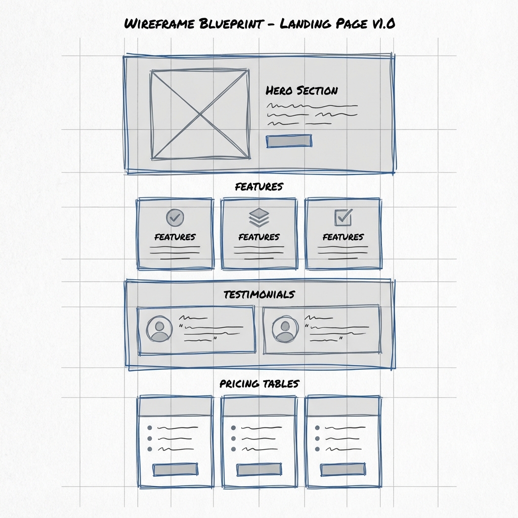
The key to speed is frontloading your thinking. Before typing, know what sections you need. Don't start with style; start with structure.
Prompt:
"Create a high-converting landing page for a productivity app called FocusFlow. The structure should include: a hero section with a compelling headline, subheadline, and email capture form; three feature cards with icons describing the core benefits; a social proof section with 3 customer testimonials; a two-tier pricing table showing Free and Pro options; and a footer with links to Privacy Policy and Terms of Service."
That single prompt defines the complete page architecture. The AI knows what sections to create and in what order.
Minute 2: First Look
Hit enter. BYOB starts generating.
Within 30-40 seconds, you have a complete working landing page. Not wireframes—actual styled components with placeholder content. The hero has a gradient background. The pricing table has hover states. The footer looks finished.
Everything is already responsive. Pull up the mobile preview and you'll see the layout adjusts properly. The structure work is done.
At this point, you're already further than most people get in an hour with traditional tools. But the placeholder content is generic. Let's fix that.
Minute 3: Fix the Copy
Placeholder text kills conversions. "Welcome to our amazing product" says nothing. "Lorem ipsum dolor sit amet" is obviously placeholder. Real landing pages need real words.
Prompt:
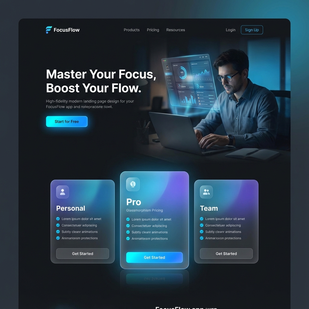
"Update the content throughout. Change the main headline to 'Focus More, Achieve More'. The subheadline should say 'Stop fighting distractions. FocusFlow uses AI to protect your deep work time so you can ship faster.' Rename the features to 'Deep Work Timer', 'Distraction Blocker', and 'Progress Analytics' with descriptions that explain each benefit. Make the testimonials sound authentic—real names, specific results like 'increased my productive hours by 40%'."
The AI rewrites all the copy in place. Same structure, much better content. It sounds like a product someone might actually pay for.
Minute 4: Visual Polish
The default styling is fine, but "fine" doesn't convert. Great landing pages use visual design to direct attention and create urgency.
Prompt:
"Switch the overall theme to a deep dark mode with an electric blue accent color (#007AFF). Add a subtle glassmorphism effect to the pricing cards—slight transparency with backdrop blur. The 'Get Started' button in the hero section should have a gentle pulse animation to draw the eye. Make the testimonial section feel more premium with larger photos and a subtle gradient background."
The page transforms. Dark theme feels more premium. The pulsing CTA button draws attention without being obnoxious. The glassmorphism adds depth and modernity.
Minute 5: Deploy
Stop tweaking. Ship it.
Click the Deploy button. BYOB compiles your page into optimized production code, provisions an SSL certificate, and pushes it to a global CDN.
In about thirty seconds, you have a live URL. Something like focusflow-landing.byob.site.
Copy that link. Share it. Your landing page is live on the internet, and it took five minutes.
What You Just Built
In five minutes, you created:
- A complete landing page with hero, features, testimonials, pricing, and footer
- Fully responsive design that works on desktop, tablet, and mobile
- Custom styling with dark mode, animations, and glassmorphism effects
- Real copy that describes your product (not placeholder text)
- A live URL with SSL, served from a global CDN
This isn't a demo or a mockup. It's a real webpage that real people can visit. If you connect a form backend, you can start collecting emails immediately.
What's Next
Five minutes gets you live. From there, you can iterate:
Add more sections: "Add a FAQ section answering common objections about the product."
Collect leads: "Connect the email form to a Mailchimp list" or "Store signups in a database."
Track performance: "Add analytics to see where visitors come from and what they click."
Custom domain: "Map this site to focusflow.io."
Each of these is a short conversation, not a project. You extend the page incrementally as needed.
The Point
Landing pages shouldn't take days. The traditional timeline—scope discussion, wireframe, mockup, development, testing, deployment—exists because the tools required it. Not because the work is actually that complicated.
BYOB collapses that timeline. Five minutes from idea to live URL. Whatever you were going to build next week, you can build this afternoon.